Letterform Archive
Last week was a whirlwind as I ran all over the San Francisco Bay Area learning about the letterpress resources that are available there and absorbing as much information as possible from each source place when I visited them. Before I go any further, I need to thank my friend, Carl Crossgrove, for making many of the arrangements to visit these amazing places. He’s a talented type designer living in San Francisco and working for Monotype in Redwood City so he has all kinds of connections in the type and printing world in that area.
The first amazing place that we visited was the Letterform Archive. Rob Saunders, the collector of this incredible library, was friendly and welcoming, despite the fact that they were technically closed this week. Carl had called ahead and let them know what I was interested in so there was a stack of material on the table when we arrived.
Before diving into my area of special interest, Rob gave me a brief glimpse into the history of the written word. First, cuneiform. This clay tablet contains one of the first forms of writing, logo phonetic signs along with proto-alpabetic characters. It was used for a few thousand years before being replaced by the first “alphabetic” writing systems during the Roman Era.

[Cuneiform on Clay Tablet]
[Hierarchy in Illuminated Manuscript]
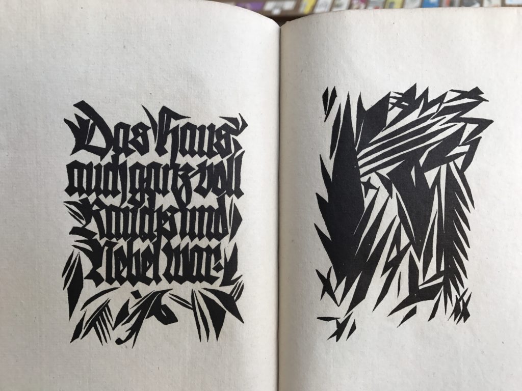
[Hand Carved Blackletter]
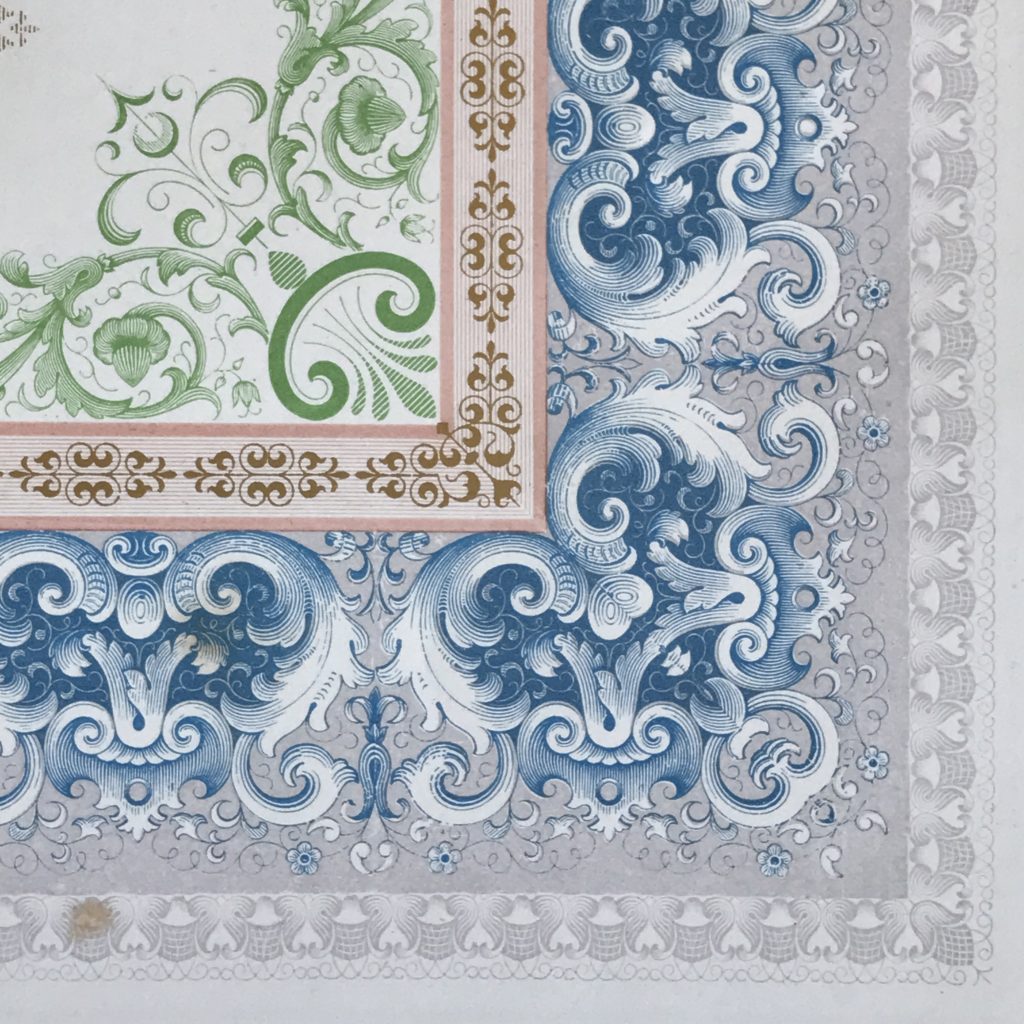
“The type specimen book of the Derriey Foundry produced for the Great Exhibition in London 1862 is an outstanding example of letterforms and of precision in composition and printing.”
This book blew my mind and could only have been produced by a foundry that had control over every aspect of production from the design to the casting, customizing, and printing. There are many examples of chromatic pairs of ornaments designed to work perfectly together. On this page, it’s subtle but you can see an example of this perfect marriage of multiple impressions by looking at the corners. The dark blue in the middle of that ornament is achieved by layering the light lavender-grey and the deep blue with separate sorts. Truly mind-blowing.
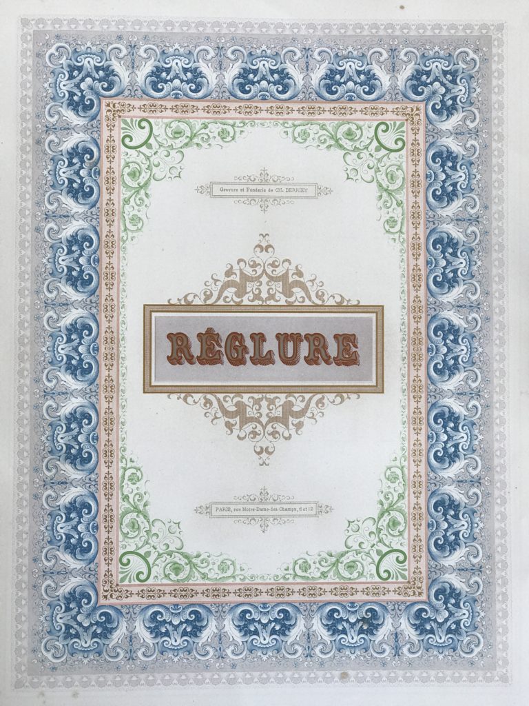
[Letterpress Ornaments of Exquisite Quality]

[Detail]
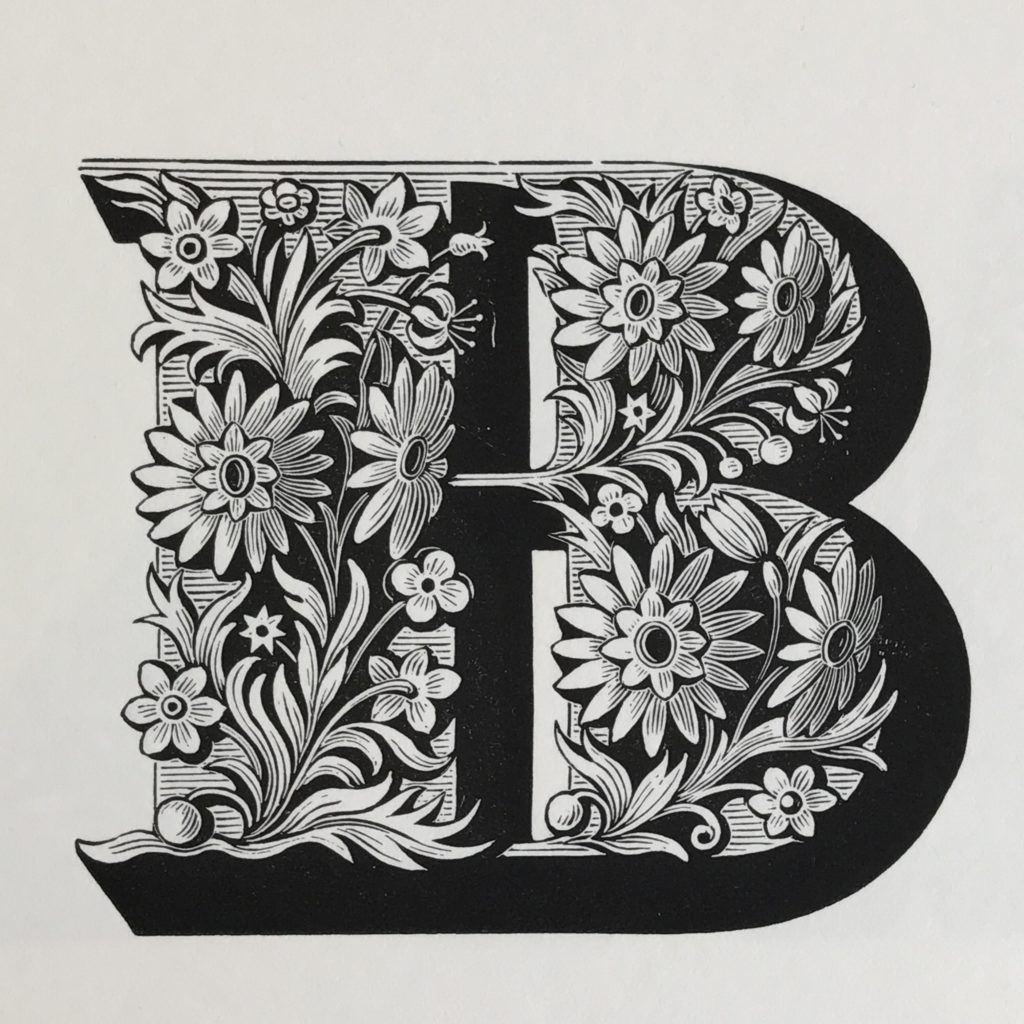
[Poucheé Flowery B Closeup]
[Another Page From Poucheé]
Sans serif typefaces continue to be a mainstay in simple, clean, professional type design. My current goal is to find an old grotesque from the era well before the Helvetica, Futura, and the other modern geometric sans serif typefaces. I want one that still has some evidence of the pen strokes and human hand that underlie all typography, while giving the clean modern look that so many of my customers want.
I left the Letterform Archive inspired and very tired from absorbing so much information in such a short span of time. If you’re ever in San Francisco and interested in seeing some of the most amazing examples of lettering and type in the world, get in contact with them and schedule a visit.
Sorry, the comment form is closed at this time.