December 31, 2015
In
Uncategorized
Transparent Ink For Greater Tonal Gradation
One of my technical goals with the printmaking is to strategically use overlapping transparent inks to create a rich set of tones from a few plates. In this next exercise I’m cheating (or just making it easier on myself) by choosing a set of colors that will behave well even if they overlap in unintended places.
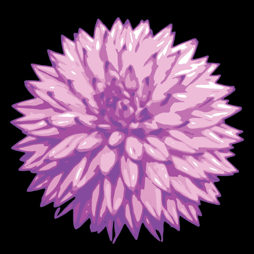
First, I did a digital simulation of how semi-transparent inks might react if they were printed over each other. The purple will go down first, covered by the creamy magenta, and finally, the pink.


[Ink layering simulation]
From this simulation I created a palette of five colors and used them to create an image.
[Image using those 5 tones]
Next, I broke the image down into separate plates, being careful to remember which plates contribute to which final tones. You’ll notice in the ink simulation image above that the first and last inks contribute to two tones each while the second ink contributes to three. It’s a little tricky, but I think I separated them right…
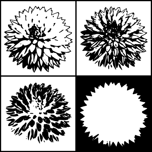
[Separate plates for separate inks]
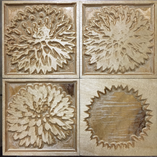
Here are the blocks, all shellacked and ready for the final sanding and printing after they’ve dried overnight.
[The carved blocks]
Now all I have to do is mix up inks with the right amount of opaque coverage and the right colors to behave like the simulation. Transparent tint base and opaque white are my friends. Tomorrow is going to be fun!
Sorry, the comment form is closed at this time.