December 27, 2015
In
Uncategorized
First Color Separation, In Theory
Now that I’ve got a registration system to print multiple passes in the correct location on the page, it’s time to take it up a notch. The style that I want to foster is one that uses a lot of color, carefully registered.
For today’s test, I’m going to attempt to render a scene from this morning’s snow.

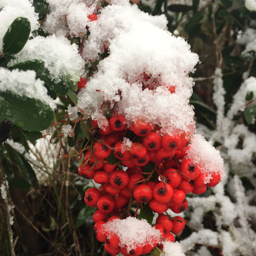
[Source Photo]
For now I’m cheating and using an iPhone app to create a “cartoony” version of it. The app isn’t as flexible as the software that I’ll write myself if I decide that I like this type of style.
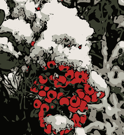
[Stylized Image]
This may look ready to print, but it’s really not. There are too many ink colors and the inks don’t overlap at all.
In the following image, I have processed it to create the color separations. For a first test, I’m only using ink transparency in one part of the image, the brownish shadows of the berries. In those spots, transparent red will be printed over the green. Eventually, all four inks will have overlapping portions, giving me a total of sixteen colors.
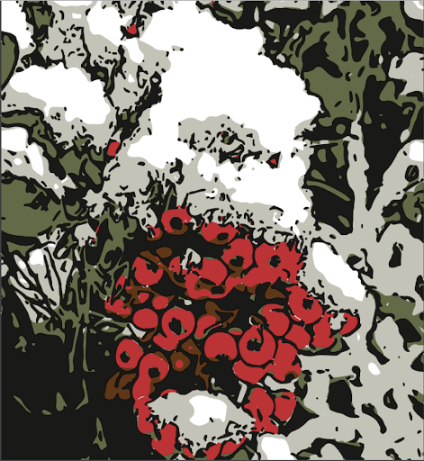
[Color Separation Simulation]
Here is the result of the color separation. Tomorrow I’ll carve four blocks, one for each color, and print them in order to create a colored image. Wish me luck!
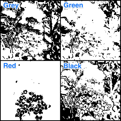
[Separate Plates]
If folks are interested in the details of using free software, Gimp, to do these color separations and the simulation shown above, drop me a line and I’ll be sure to write that post. Otherwise, meh! I’ll probably write about other, less technical stuff.
Sorry, the comment form is closed at this time.